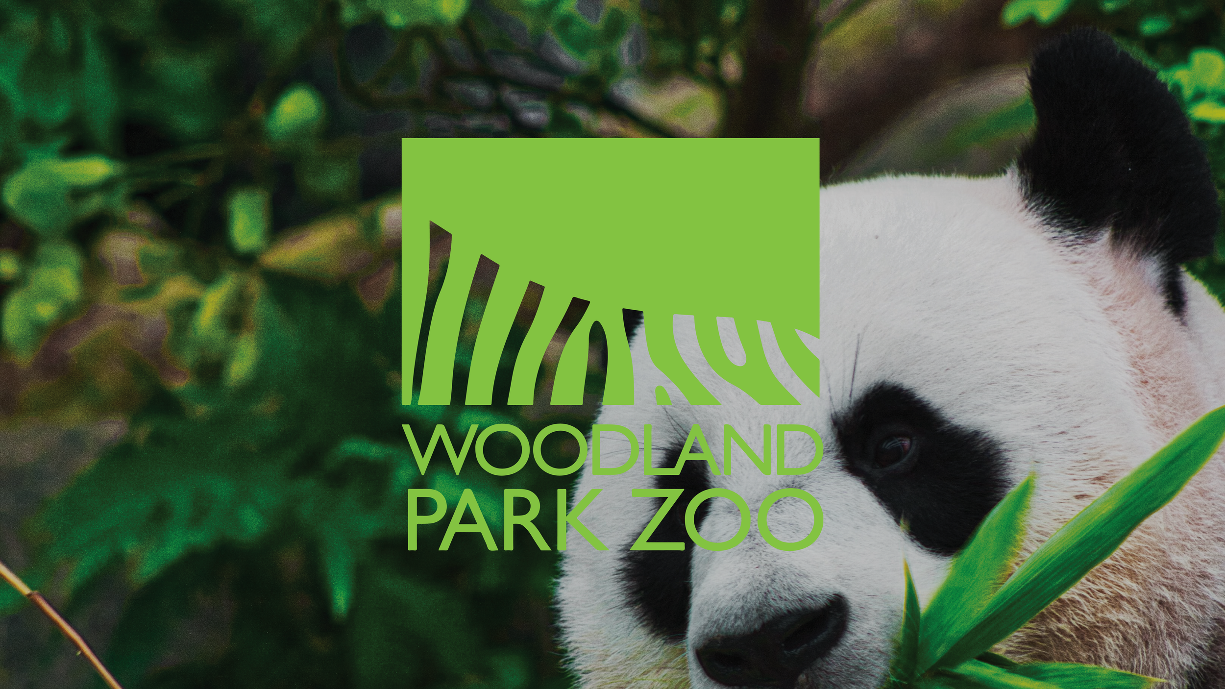
WOODLAND PARK ZOO REDESIGN
Redesigning the Woodland Park Zoo mobile application to provide greater clarity in the navigation, intuitive information architecture, and increase visibility for their events and ticket purchases.
PROJECT OVERVIEW
SKILLS
Research, information architecture, wireframing, prototyping, visual design, creative direction
TOOLS
Pen & paper, Figma, Adobe Illustrator
TIMELINE
3 Weeks
Before interviewing users, we decided to perform a competitive analysis of popular Zoo applications to understand which features users might be expecting from the market.
Common Features In The Market:
Easy navigation
Events schedule
Interactive map
Ticket purchasing
Competitive Analysis


User Interviews
The purpose of this research was to uncover roadblocks that youth and their parents have experienced in using the Woodland Park Zoo App. We performed 3 user interviews with a mix of participants who have visited the Zoo in the past month.
Results
“The application was confusing and it seemed out dated”
“The map was really hard to use and was not interactive”
“Most of application just linked out to the website and did not give it a seamless experience”
“The application was confusing and I wasn't sure how to work it”
Users are overwhelmed and confused
Users want an application that is easy to use. Most users are walking while using this application so simplicity is key.
Checking out was difficult
Users found it hard to purchase tickets for the next time they wanted to visit. The application linked to the Zoo’s website making some functionality difficult.
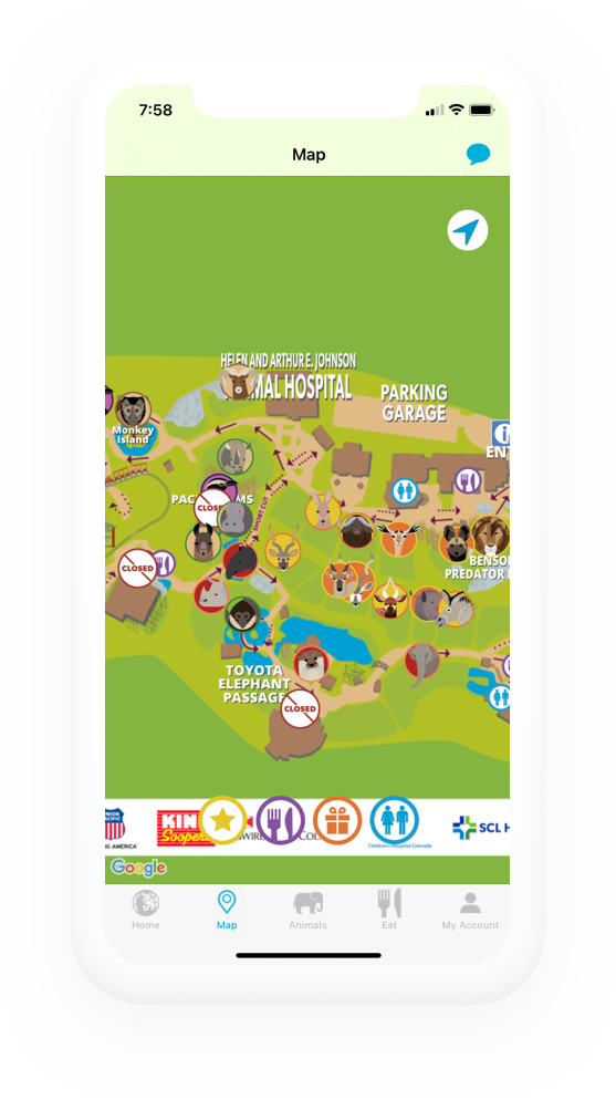
The map was not friendly
Users could not easily navigate through the map. They were unable to locate service locations or events.
Events were not a focus
Users who wanted to see what events were going on were surprised to see that they were not listed on the application

Prototyping
Design Decisions
Interactive map
Made the map interactive to give users and easy way to navigate through the park
Cleary show events
Clearly indicate how users can check on events and what days they are occurring at the park
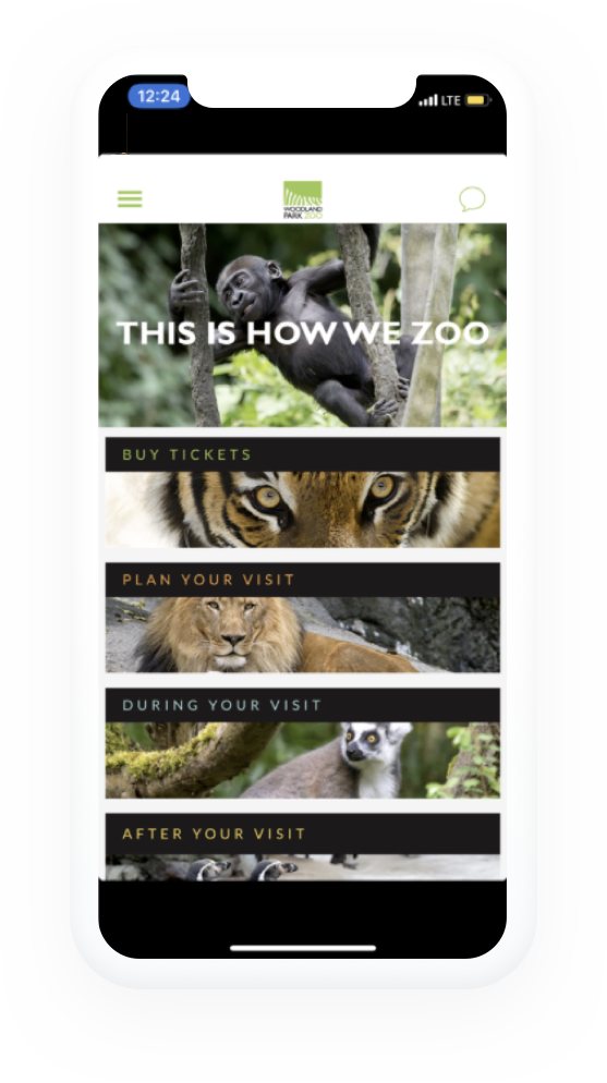
Simplify the application
Make the application easy to understand for people of all ages
Updated the checkout process
Created a more fun attractive checkout process that would be easier for people to understand.
Retrospective
Didn’t screenshot old application
We didn’t screenshot the old application so we had to find images online to show the comparison between our app and the old Woodland Park Zoo application
No contact with Woodland Park Zoo
It must be called out that I had no contact with the Woodland Park Zoo. Getting to know things that the Zoo is working on and areas that they would like to see improved, and goals for future would have informed my design direction
Low number of research participants
I did not have a robust user group to research, and while the research did inform my design direction, a higher volume of subjects would result in a more comprehensive understanding of the problem.
Next Steps
I had a lot of fun and gained experience on this self directed redesign exercise! Guided by user experience methods and practices, I moved in a design direction that defined and solved the problems I believed existed. The next step would be to do another round of usability tests on the new designs and iterate based on the findings.